The importance of good design

 |
by: Tor Radford Account Director |
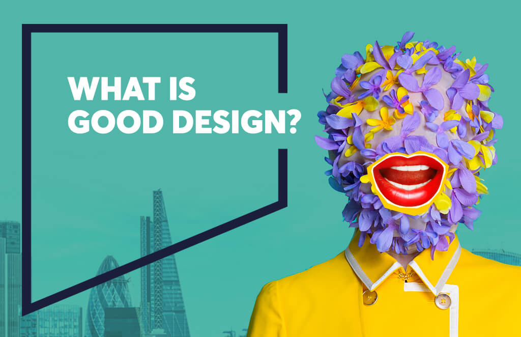
What is good design?
Good design is innovative. Good design makes a product useful. Good design is aesthetic. Good design makes a product understandable. Good design is unobtrusive. Good design is honest. Good design is long-lasting. Good design is thorough down to the last detail. Good design is environmentally friendly. Good design is as little design as possible. According to design thought leader Dieter Rams, these are the ten key principles that constitute great design. Whilst our lives and consumption habits might have drastically changed since Deiter wrote these, the fundamentals of these principles are still wholly relevant today.
The point is that design is often thought to be a solution, the designer’s problem to solve right at the end of the process. But design is so embedded into what we see and do and feel each and every day, that good design in itself can often go unnoticed. Or in some cases, it’s so good that it’s invisible.
Aesthetics vs usefulness
Just because something is aesthetically pleasing doesn’t necessarily mean it will fulfil its purpose – on top of looking good, it needs to perform, convert or create an emotional response.
For example, we all have a designer friend who has an inbuilt hatred for the font Helvetica. There aren’t many typefaces as divisive as Helvetica. Helvetica is so well-used because it simply works so well. That’s not to say that the classic typeface hasn’t suffered from usability issues in the more recent smartphone era though. It has needed to adapt with the times to remain relevant in digital contexts – especially as Google, Apple and other large tech companies started to adjust the font for better legibility in smaller and online formats. Whether you love it or hate it, its highly legible, easily adjustable and clear at every font size – making it fit for purpose on so many levels.
So does this mean that if something is visually complex or cluttered, then it’s perceived as less beautiful? It’s quite possible, yes. If we look at websites as another example, a Google Research Study found that users prefer designs that look both simple (low complexity) and familiar (high prototypicality) as opposed to cluttered websites with lots of imagery, text and other elements. By the same token, if the design is unfamiliar, it can be perceived as less appealing, even if it is simple to use. It’s in our nature to make these decisions in a split second and if you stray away from these expectations, then you’re at risk of damaging first impressions and reputation.
It’s also in our nature to eat with our eyes too – the way design is used in packaging and food can have a significant impact on how we perceive or even taste products. In his book, Blink, Malcolm Gladwell notes how adding 15% more yellow to the packaging of 7up led to consumers reporting a more lemony flavour, even though the drink itself remained the same. There’s also another widely publicised example in the form of margarine too – in 1940 consumers were simply not interested in margarine – it was found to be unattractive with its white colour and had little resemblance to butter. By adding an artificial yellow colouring, it was proven that people liked margarine far more when it actually looked more like butter. This is not always something that we do consciously and is called sensation transference – a phrase coined by Louis Cheskin, a scientist and marketing innovator who spent his life investigating how design impacts perception of value, price, appeal and relevance.
So, taking all this into account, the real beauty of design can be in legibility, usability and functionality – but attractiveness still has a rightful place too.
Good design is (sometimes) invisible
Let’s look at Netflix – the go-to platform of choice for movies and TV series. They have designed a service for more than 130 million customers in more than 190 countries with extensive personalisation features across a multitude of devices. According to Jared Spool, an expert on usability and design, when Netflix asked their users what they liked about the service, they replied with “Great selection of movies, helpful recommendation tool and overall good service”. But they didn’t mention that the site was super functional, intuitive and well-designed. And that’s not because these aspects aren’t important. It’s because the designers have done their job really well, they’ve made them invisible. In this instance, a company that has focused on designing the best experience possible has enabled the content to be the hero, not the experience itself.
Left is best. Or is it?
So you’ve spent hours, weeks, months on your new logo and brand purpose and have defined how your brand is going to speak and behave.
But what does your brand application say about you in terms of your profile? Does placing your logo on the left make you a more traditional brand? Not necessarily, no. Any designer worth their salt will advise that generally left is best, online that is, and it’s generally true. This side of the world, we read from left to right, so our eyes gravitate to the left of a page – printed or online – and that’s where the letterhead logo has traditionally sat. There are obviously brands that are suited to a centre or even a right-aligned logo, but it has been proven that left-aligned logos are better for brand recall, more likely to be labelled unique and perceived to be more distinctive and stylish than right-aligned logos.
There is also research to suggest a strong correlation between the location of a logo and perception of power and brand superiority. For example, a well-known, powerful brand like Kellogg’s will put their logo at the top of the packaging, reinforcing the consumer perception of power and status. Have you ever noticed that you look to the lower shelves for the own-brand products? The store shelves might be organised so the powerful brands are at eye-level, but psychology says that we instinctively make the connection between power and height, so we expect the more affordable and accessible brands to be on the lower shelves. Common sense says that logo placement should also reflect that too. Depending on the impression that you’re looking to leave consumers with – exclusive, authoritative, powerful vs accessible, younger, affordable then it’s worth considering whether your logo positioning is aligned to your brand positioning.
Design is simply about communication.
All too often, there is a misconception that design is about the way a product, image or advert looks, but good design communicates to your audience in the best possible way. Steve Jobs said that, “Design is not just what it looks like and feels like. Design is how it works.”
Great design considers what a product is, how a product works, who your audience is, what information is relevant, and in which order it needs to be displayed. A quick search of Google will return an extensive list of best practices and the industry standards from the graphic design community. And of course, there are a few golden rules that are long-established, but ultimately great design is all about balance, hierarchy and structure that communicates a message clearly and effectively – regardless of the medium.
So you might have guessed it – we are passionate about design. As a creative communications agency, our commitment to delivering excellent creative and design services is top priority, as we understand that making good design decisions can make a huge difference in how consumers perceive brands and consume products. If you’d like to chat, then our talented team of design experts would love to talk.
